Minnesota Timberwolves · 2024–Present
Rebuilding the Internal Tool an NBA Team Runs On
The Timberwolves' internal platform had become slow and easy to ignore. I was the sole Design Engineer on the rebuild: component system, Figma to production, six usability cycles. Task completion time dropped 40%.

The Problem
The internal platform had been built and rebuilt by different developers over the years. By the time I joined, it showed: inconsistent UI, slow load times, and a navigation structure that made it hard to find what you needed quickly. The deeper problem surfaced in user surveys, coaches and scouts were asking 'why would I use this instead of ESPN or Basketball Reference?' If the internal tool can't offer something the public tools don't, it loses. The Timberwolves needed staff to actually use the platform, it holds proprietary data and workflows that public tools can't replicate, but the product wasn't giving them a reason to stay.
Discovery
- 01
I ran user surveys with coaches, scouts, and front office staff early on. The top complaint wasn't a specific broken feature, it was a general sense that the tool felt dated and slow compared to what people used outside of work. The 'why would I use this?' response told me the problem was about perceived value, not just usability. If people didn't trust the tool to be fast and accurate, they'd route around it.
- 02
I looked at which pages had the highest traffic to figure out where a revamp would have the most leverage. The home page, player profiles, team profiles, and reports pages were where staff spent the most time. Fixing low-traffic pages first would have been wasted effort.
- 03
The assumption I came in with was that the visual inconsistency was the main problem, fix the UI and people will use it. What I learned was that performance mattered just as much. A good-looking page that takes three seconds to load still loses to a fast ugly one. That changed how I prioritized the work.
Key Decisions
- ·
I focused the first phase on the four highest-traffic pages rather than attempting a full platform rebuild. A full rebuild would have taken months and delivered nothing in the interim. Starting with home, player profiles, team profiles, and reports meant staff saw improvements quickly, which built trust that the project was real.
- ·
For each page, the work combined three things: visual consistency, better filtering, and new ways to look at stats. The filtering improvements came directly from user feedback, staff wanted to slice data in ways the old tool didn't support. The new stat views were about giving the platform something the public tools don't have: proprietary context and org-specific framing.
- ·
I chose not to touch the underlying data infrastructure, even though some of the performance issues lived there. That was an engineering project with different owners and a much longer timeline. My scope was the product layer, what staff see and interact with. Keeping that boundary made it possible to continue shipping improvements while communicating with the data team about what performance improvements were possible in the future.
- ·
Maintaining consistency across a Django app required a different approach than a React component library. I built a global stylesheet with shared color variables, spacing, and typography that every template inherited. The same color scale used to represent performance in the stat sliders appeared identically in the shooting zone map. For reusable UI, I built template partials for components like the filter bar and data table. Build once, maintain in one place, every page stays consistent automatically. The system documented here represents a fraction of the components built across the platform.
Outcome
Load times dropped from around 4 seconds to 1.5 seconds. Task completion time fell 40% across six usability testing cycles. The consistent refrain from staff is that the tool feels faster and easier to navigate. The 'why would I use this' question has shifted: the platform now has filtering capabilities and stat views that public tools don't offer, which gives staff a concrete reason to stay. Screenshots and UI details are omitted per NDA. Happy to walk through the work in a conversation.
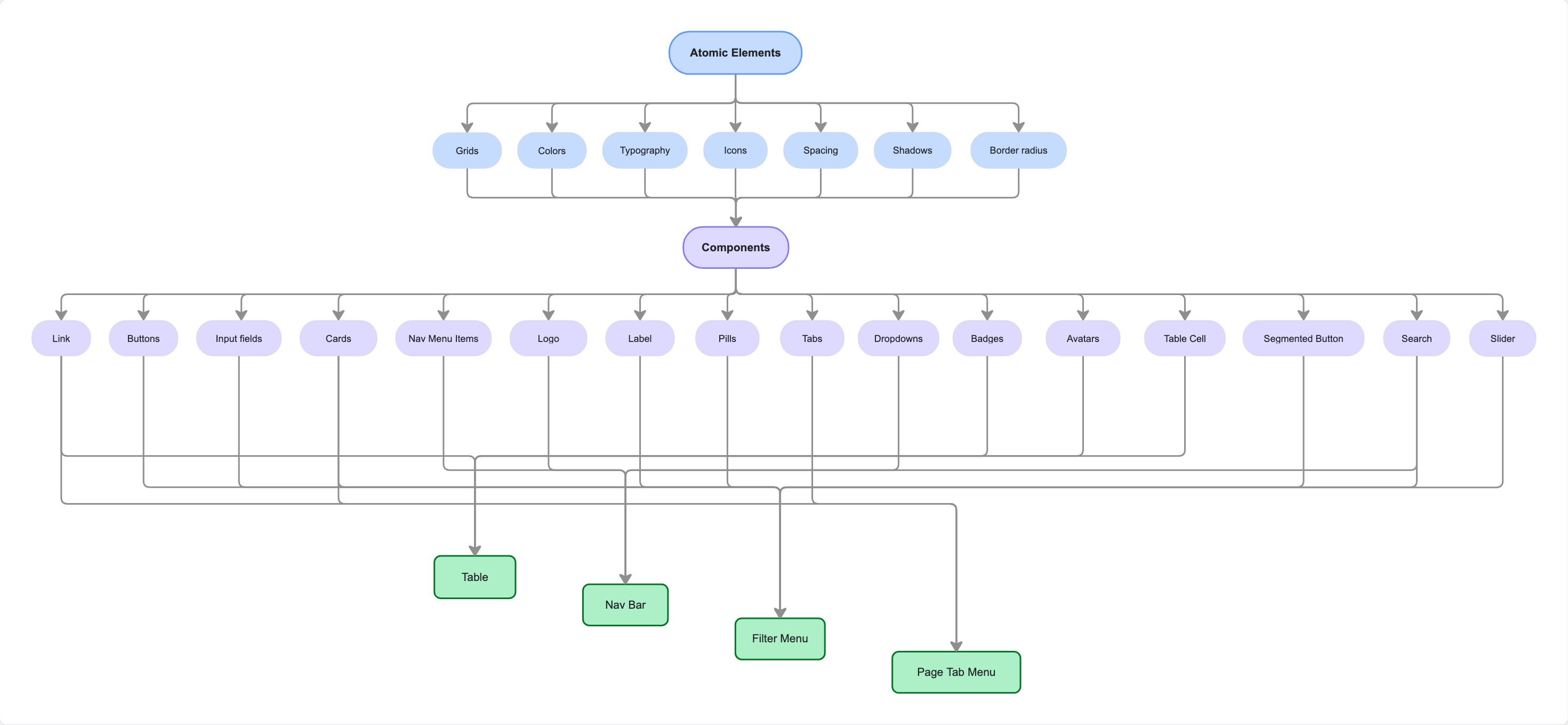
A partial view of the component hierarchy. The full system spans 15+ pages and additional components not shown here.
Pages revamped
15+ pages
Load time
~6s → ~1.5s
Active users
~30 staff
Task completion time
↓ 40%
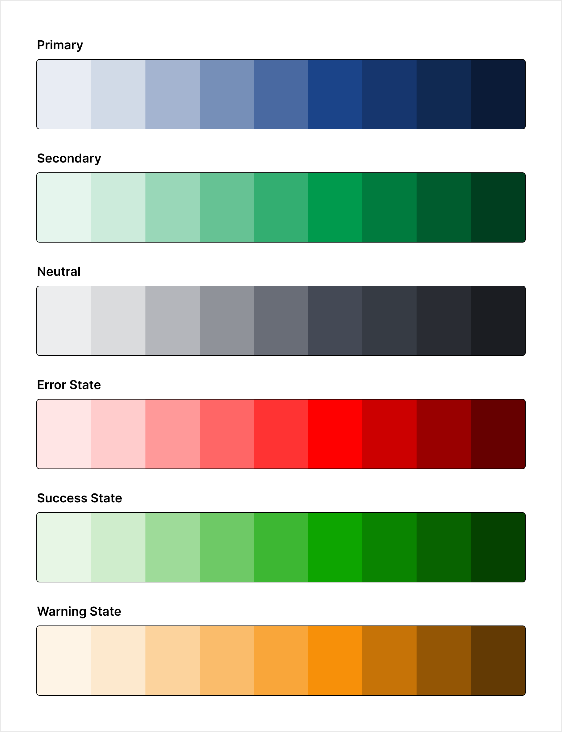
Color system: primary, secondary, neutral, error, success, and warning scales
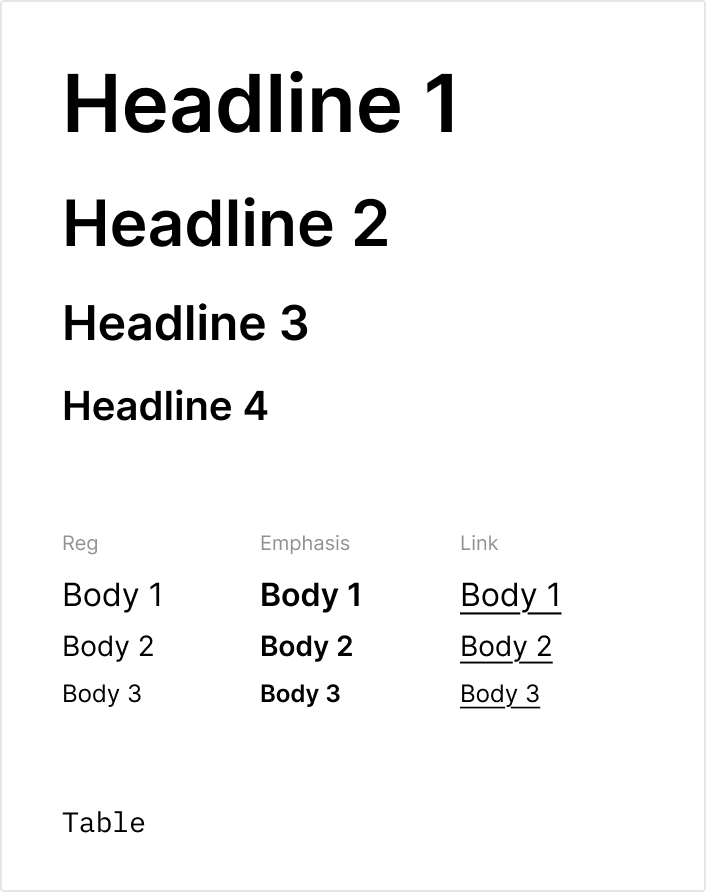
Typography scale: four headline levels, three body variants across regular, emphasis, table and link styles
What I'd Do Differently
- ·
I would have pushed for a more structured discovery phase. I had a clear sense of the problems from my own observations, but I ran the user surveys too informally. The questions were open-ended and the responses were hard to prioritize. A more structured approach would have given me cleaner signal earlier.
- ·
I also underestimated how much the performance issues were tied to the data layer, not just the UI. Some of the load time improvements required going deeper than I initially scoped. If I were starting over, I'd spend the first two weeks mapping the full stack before committing to a plan.